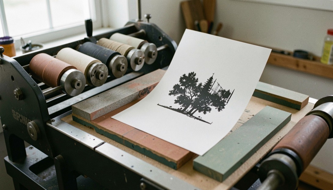
A printed card, token or ticket works when a person can read it at arm's length, in poor light, without turning it over. That means the design is settled before the press runs: size, stock, ink, finish and the one mark that must stay legible. Production is then a matter of holding registration and repeatable color across a short run, and reading is a matter of contrast, orientation and a small number of fixed cues. The same discipline shows up wherever printed pieces are compared side by side, including in the Dutch comparison work at Spelkompas guide, where conditions and identifiers are checked against a source and a date rather than taken on trust.
How are playing cards printed and finished?
Most playing cards begin as two sheets of paperboard glued around a black core, which stops light from passing through and keeps the faces from showing through. The faces are printed by offset lithography, usually four-color process for the artwork and a spot ink for the suit marks when the run is large enough to justify a separate plate. The back is printed separately and must align with the front within a tight tolerance, because a card that is cut slightly off-center is readable from the back edge.
Finishing decides how the card behaves in a hand. A aqueous or UV coating adds slip and resists skin oils; a linen finish embosses a fine texture that reduces glare under a low lamp. The sheet is then cut, often in two passes, and the deck is sorted and packed. Humidity matters more than most people expect: paperboard takes on moisture and grows, so a shop that prints in a damp room will find its cut edges wandering by the end of the run.
What makes a printed token easy to read across a table?
A token is read at a glance, from a distance, often while it is moving. Three things carry that: a single dominant shape, a value or symbol large enough to survive a thumb over one corner, and a contrast ratio that holds when the light is behind the reader. A token with fine type, thin rules or a busy border fails at two meters even if it is beautiful at ten centimeters.
Color does more work than line. A dark field with a light numeral reads faster than the reverse under a warm lamp, and a colored rim lets a player sort a stack without reading any of it. Material matters too: clay composite chips take an impression and keep it, while printed cardboard tokens lose their edge after a few evenings. If a token must be printed rather than molded, the ink should be laid on thick enough that wear reaches the paper before it reaches the symbol.
How do small print runs keep their registration?
Short runs are where registration is won or lost, because there is no time to correct a drifting sheet. The practical answer is to reduce the number of passes. A single pass through a digital press holds front-to-back alignment better than two offset passes, and a shop that prints the back first, then the face, can register to the printed back rather than to the sheet edge.
Registration marks belong in the trim area, not in the artwork, and they should be cut off rather than printed over. For a run of a few hundred pieces, a guillotine with a stop set once will beat a programmable cutter that is re-measured for every lift. The other habit is to print a few extra sheets and cut them first, so the operator sees the drift before the whole run is committed. Paper is not stable; the run has to be planned around that.
Comparing printed pieces across a table
The table below sets out what each kind of printed piece has to get right, and where it usually fails.
| Piece | Primary read | Common failure | Fix at the bench |
|---|---|---|---|
| Playing card | Suit and rank at a glance | Off-center back, glare | Linen finish, tighter cut tolerance |
| Token | Value under a thumb | Fine type, low contrast | Larger numeral, colored rim |
| Ticket | Serial and terms | Faded thermal print | Bond stock, spot ink, matte coat |
| Marker | Ownership | Ink that lifts | Sealed surface, thicker lay |
What should a ticket carry, and in what order?
A ticket is a contract in miniature, so its reading order is not a design preference but a sequence. The serial or identifier comes first, because it is what gets checked. The value or entitlement comes second. The conditions, the date and the issuer come last, in smaller type, because they are read only when something is disputed. A ticket that leads with a logo and buries the serial will slow every transaction at the table.
Thermal printing is cheap and fast, and it fades. A ticket meant to survive a season should be printed on bond stock with a spot ink for the serial and a matte coating over the whole face, so that handling does not lift the number. If the ticket is torn or punched, the punch should fall outside the printed field, not through it.
Frequent mistakes to avoid
- Printing fine type on a token and expecting it to read at arm's length, when the value needs to be the largest mark on the face.
- Registering to the sheet edge instead of to the printed back, which lets a short run drift before anyone notices.
- Choosing a glossy coating for a piece that will be handled under a lamp, where glare erases the contrast the design depends on.
- Leaving the serial or identifier in the smallest type on a ticket, so the one field that must be checked is the hardest one to find.